The brief
SPANA commissioned us to look at their Annual Review to communicate with their existing audience and also to engage new supporters.
SPANA were looking to improve their impact reporting with an engaging use of data and infographics together with case studies.
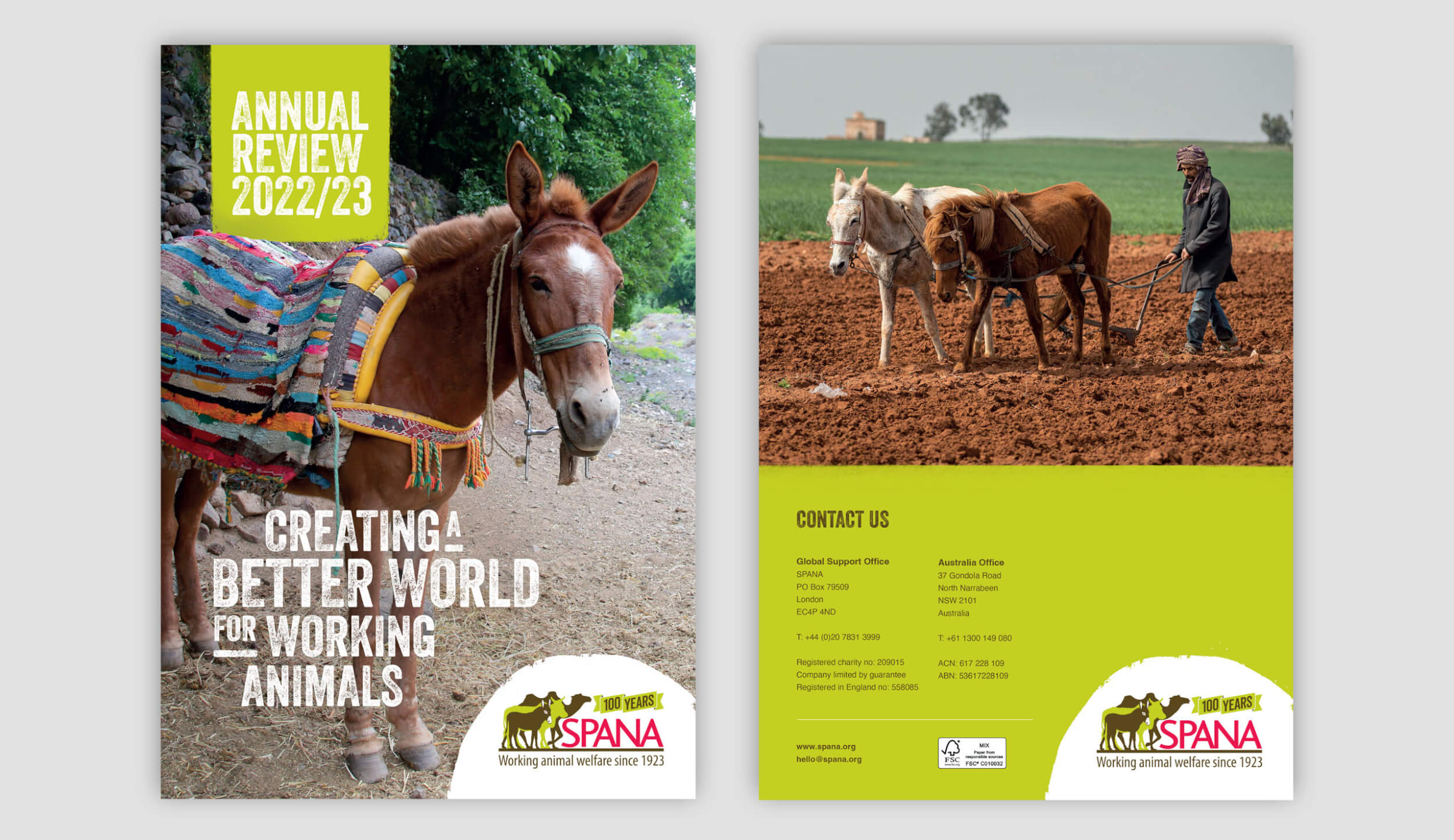
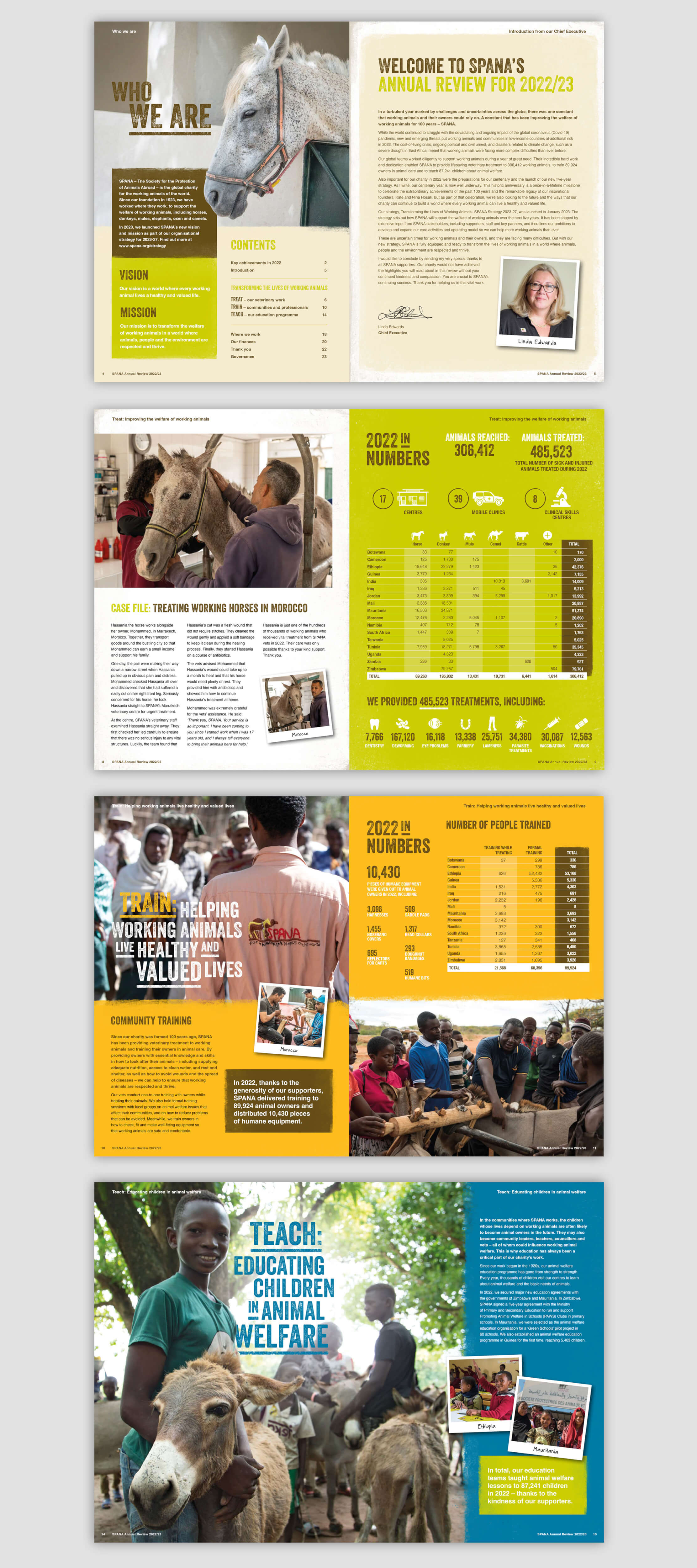
Our solution
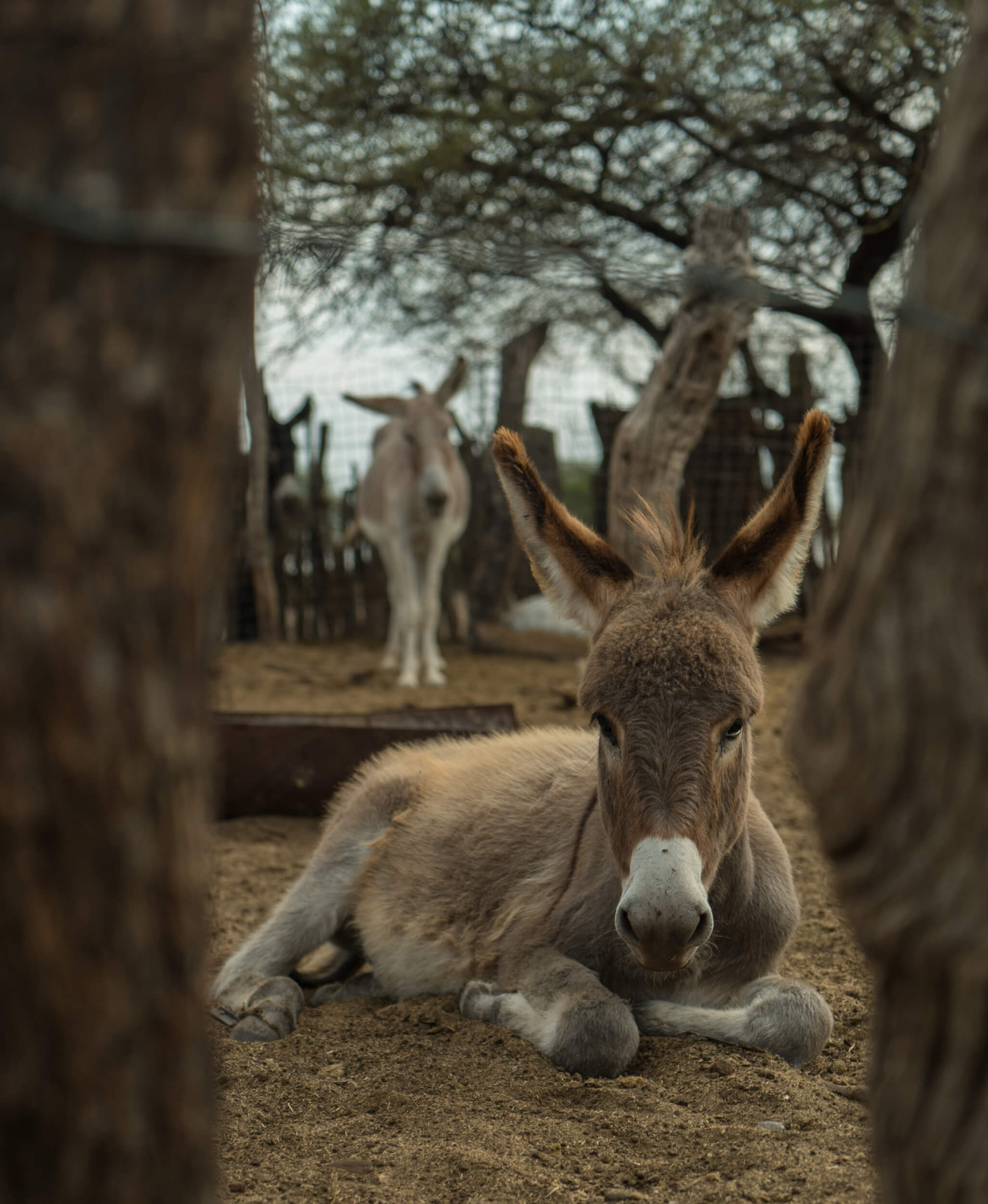
With a very targeted audience, which the charity know well, we looked at lifting the review using their superb photography in a way that carried a theme throughout to tell a story about the many areas and countries in which they work. The working animals are always front and centre so we created a design which respected this and heroed the locational imagery and the working animals in the case studies. The charity’s brand has a strong colour palette and required consideration to help balance the rich evidence based information.
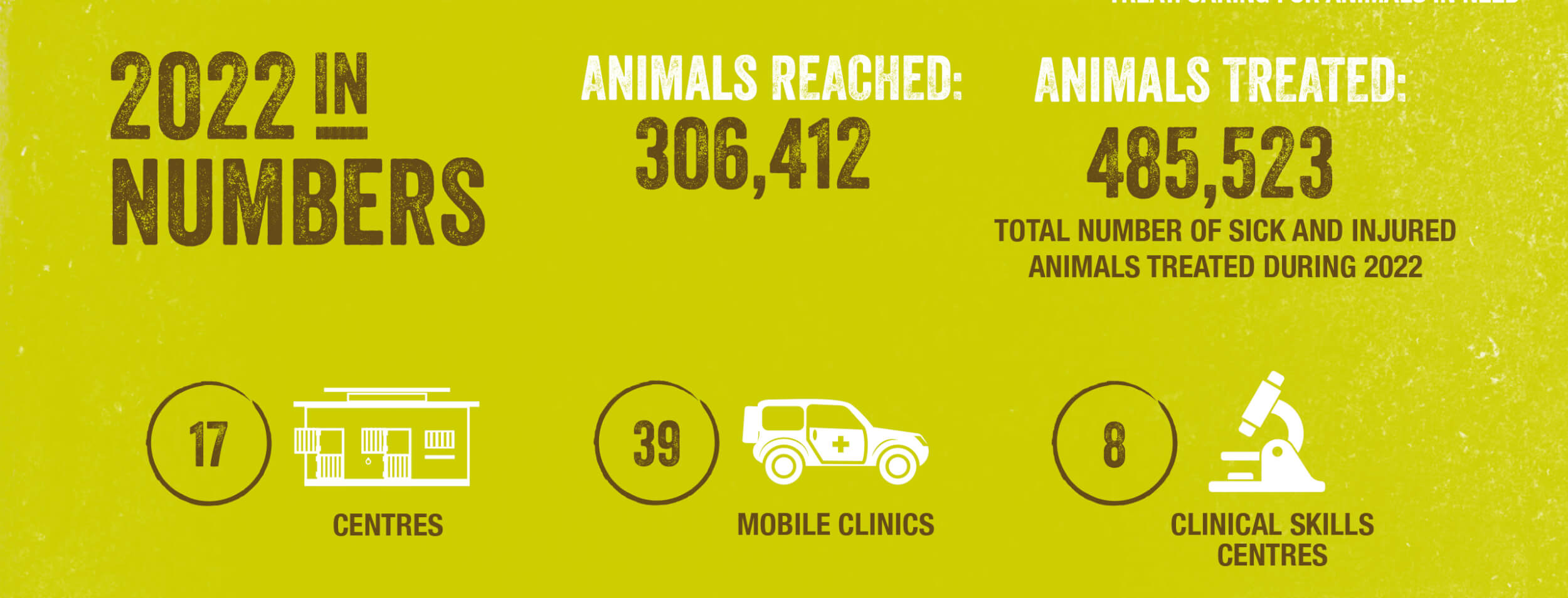
We created supporting infographics and illustrations in the brand style to bring the statistics and information to life. It was important to create a review that reflected the areas that the charity worked and use the style and design in a way that allowed the information and imagery to do the talking and not be overly designed. The project always starts with providing a clear flat plan where we make sure the document has room to breathe and provide enough space for the various sections. We then make sure that the annual review has a good visual pace throughout and makes the most of the identity. Following our tried and tested plan this created a document that the charity were able to use to communicate the success of the year with both donors and supporters alike.

The services delivered for the annual review included:
- Project planning
- Annual report design
- Infographic creation
- Adherence to existing brand guidelines
- Proofreading
We came to Door 22 with a brief to refresh our annual review, an important document in communicating the SPANA brand to donors. The time they took to understand our audience ensured the new publication resonated with donors and helped drive wider changes in our visual identity.
Director of Communications – SPANA
