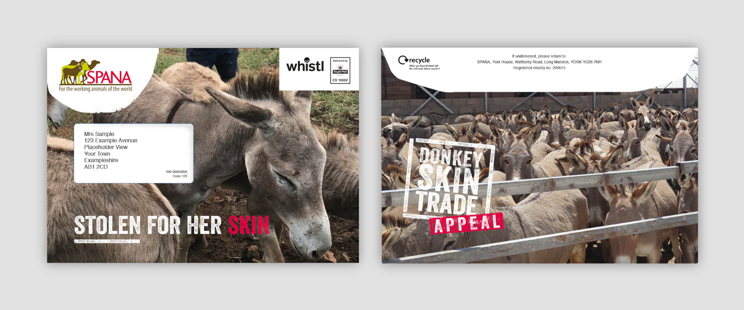
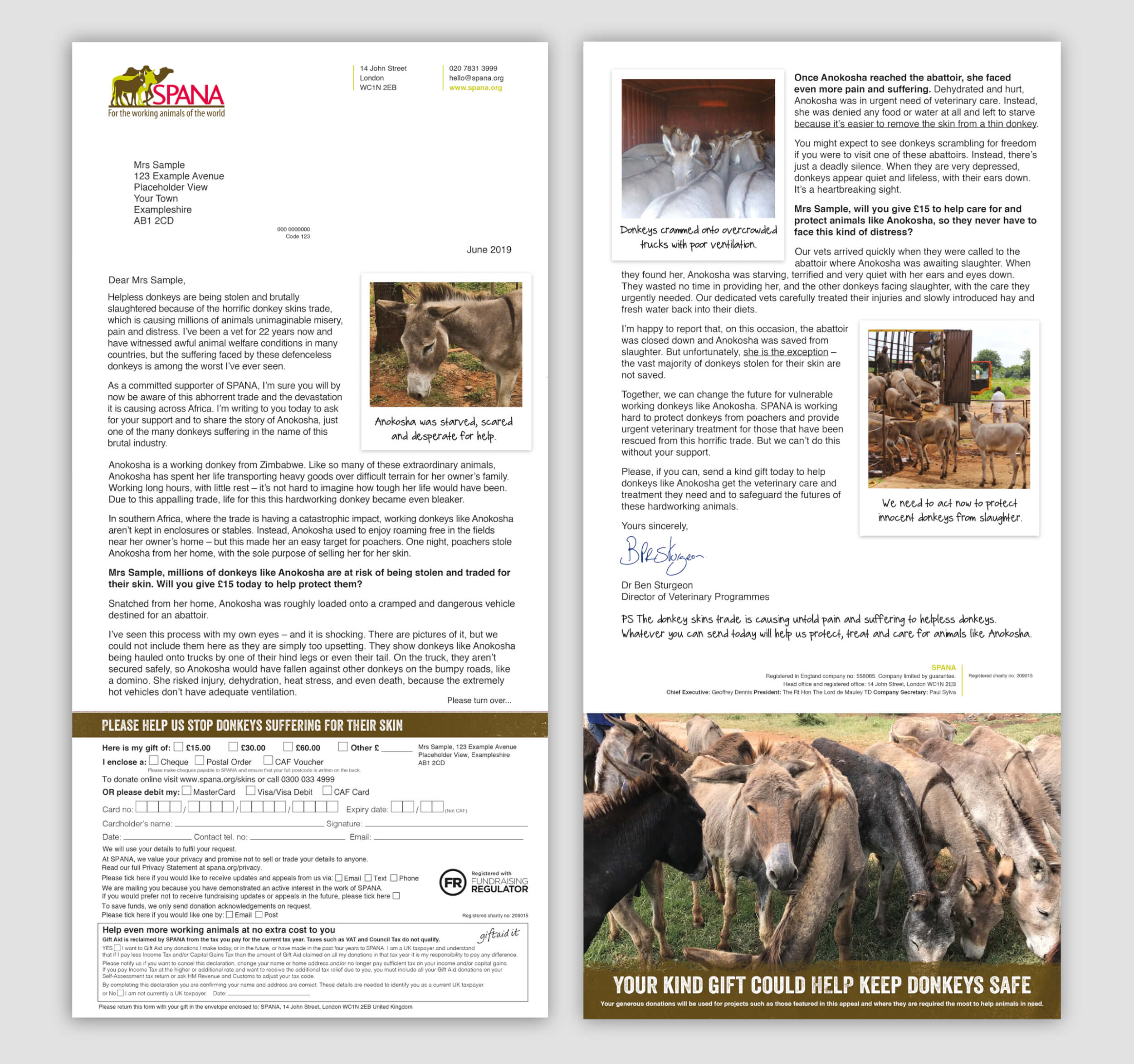
As we were communicating the issue to existing supporters we were sensitive to the subject and respectful of the audience by selecting imagery that showed the urgency but avoiding content that was unnecessarily upsetting or graphic. We were able to use considered polaroid candid style imagery to accompany the story. This is a careful balance of language and visual and the tone used throughout the pack supported the sensitivity and extent of the problem.
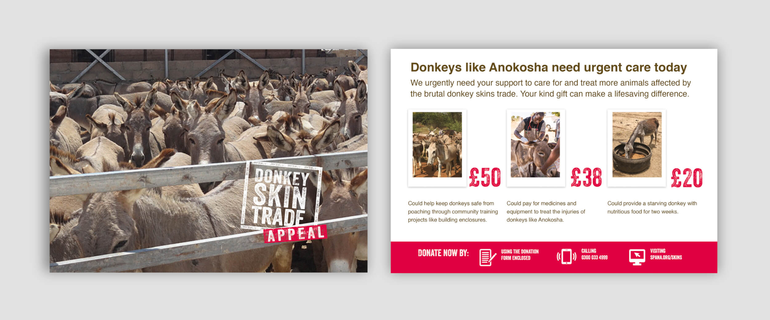
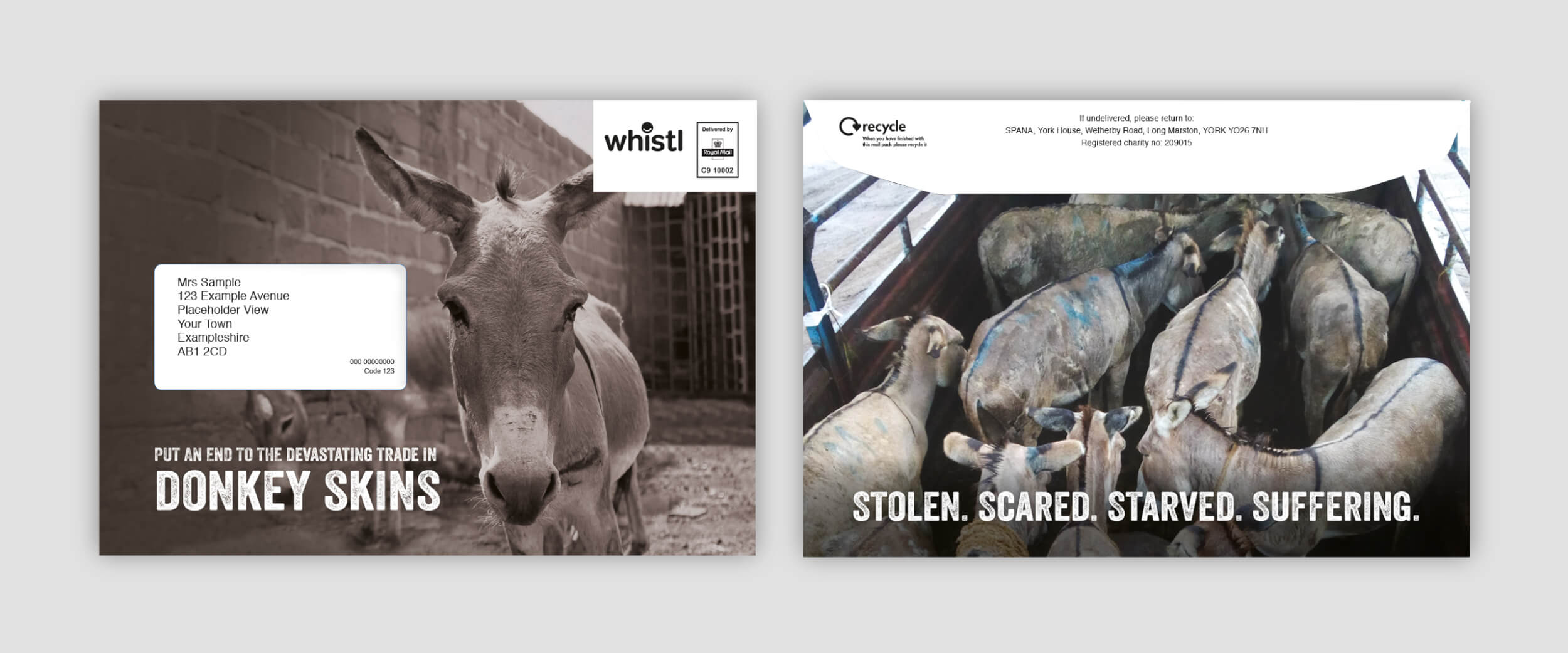
The fundraising appeal pack consisted of a C5 outer, a 2pp letter with donation form, one for a cash only ask and a version to prompt committed givers, an insert outlining the price points and suggested donation amounts and what they would support and 2 x BREs.
