The brief
Royal Surrey NHS Foundation Trust wanted to improve communication and engagement within the Trust and externally and needed to market themselves more effectively.
Central to delivering in these areas was creating a clear identity, to tell the story clearly, effectively and strategically. It was important to create an identity where staff and community would feel a sense of belonging. The aim is to raise the overall profile with not only the local community but with key partners locally, regionally and nationally.

Our solution
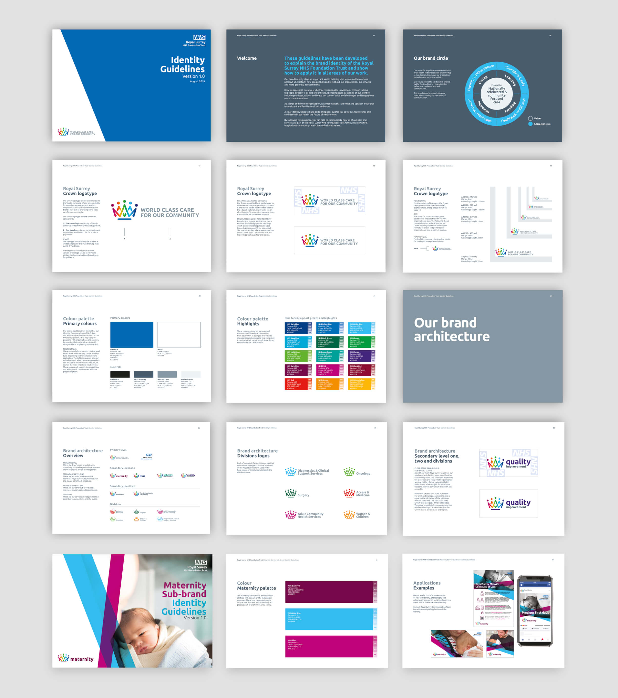
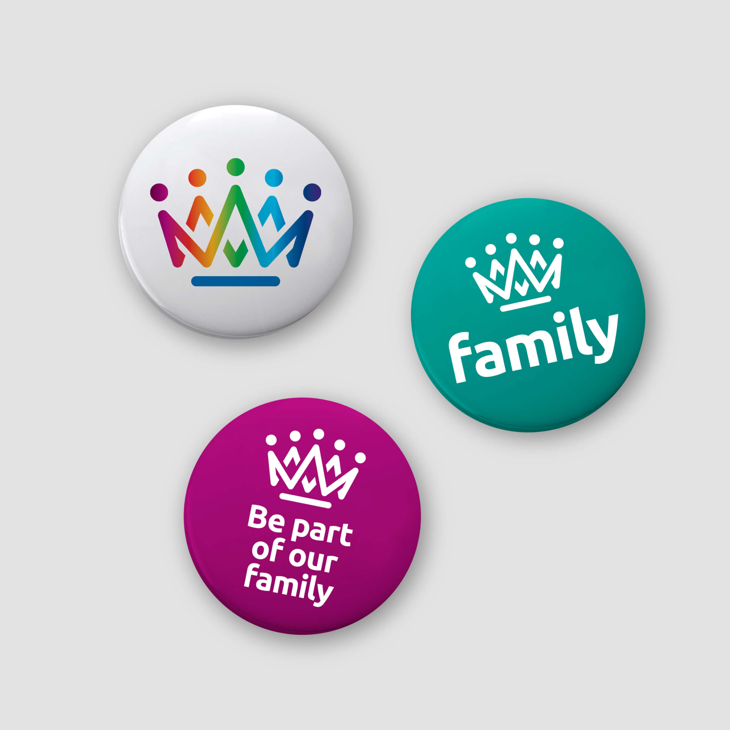
The Trust had recently changed its name to Royal Surrey NHS Foundation Trust and undergone a new communications strategy. It needed an identity and personality to visually represent the five strategic spearheads that it had identified as well as a new strapline. The mark development of a crown allowed us to immediately represent the area and also depict the five spearheads in how it would deliver care across the community.

There was a need to create an identity, personality and structure that created a joined up message and visual identity so that everyone knew the services, teams and broader health services all belonged to the one Trust providing reassurance and confidence. To create ownership, belonging and a sense of pride as well as creating a clearer public awareness. The Trust was wide ranging in its services and we created a solid brand hierarchy supporting the primary, secondary, third level and internal divisions. The solution created a family of identities that work in harmony and also in isolation.
The branding was a regional personality that sat under the NHS brand and we created an identity that worked together with this brand and provided the Trust with guidance for how to use this partnership.
The services we delivered for the NHS regional branding project included:
- Brand development
- Brand hierarchy
- Brand identity
- Brand guidelines
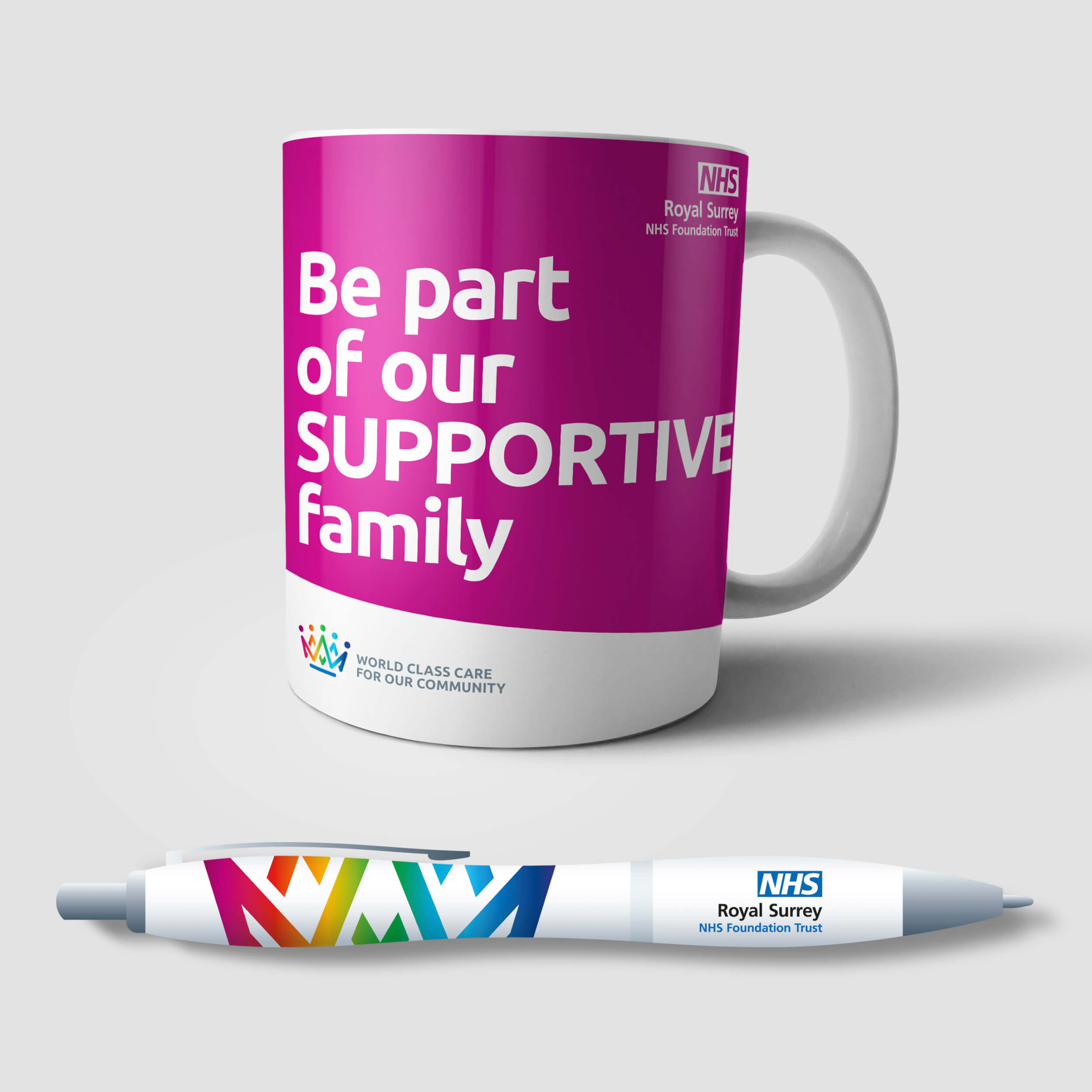
- Brand toolkit
- Sub brand development and separate guidelines
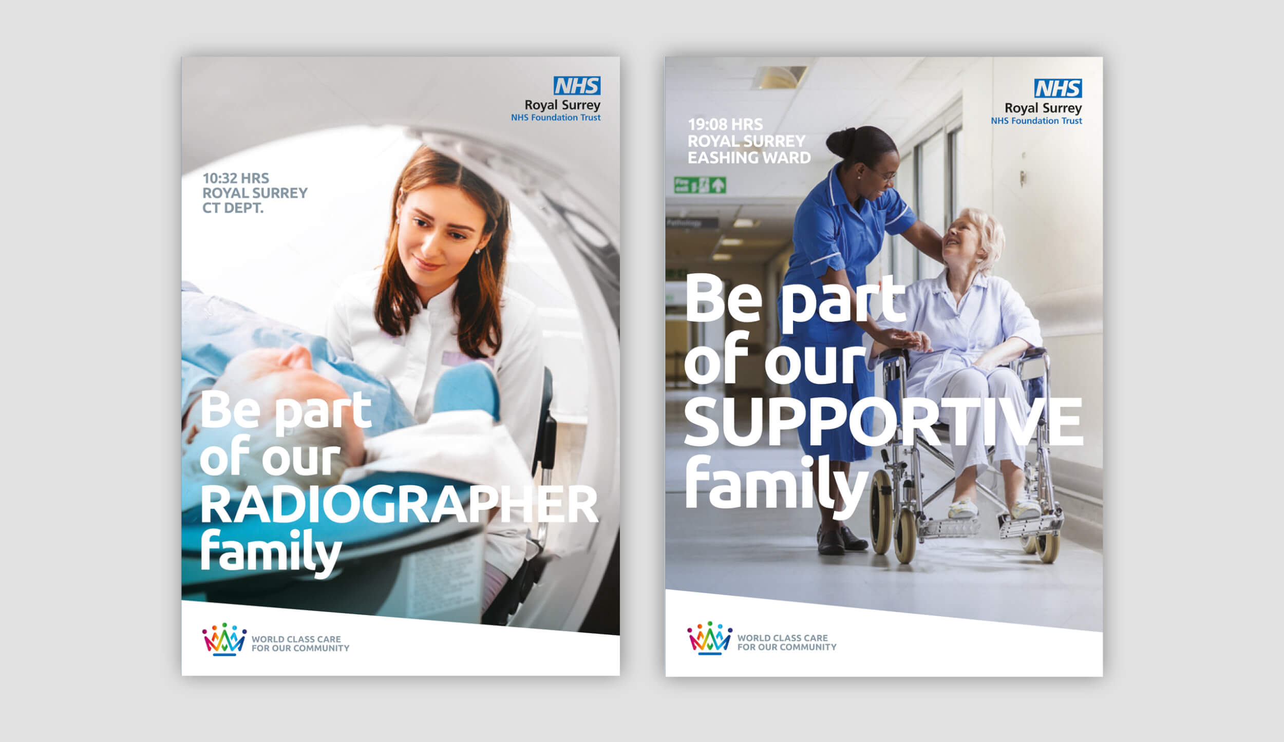
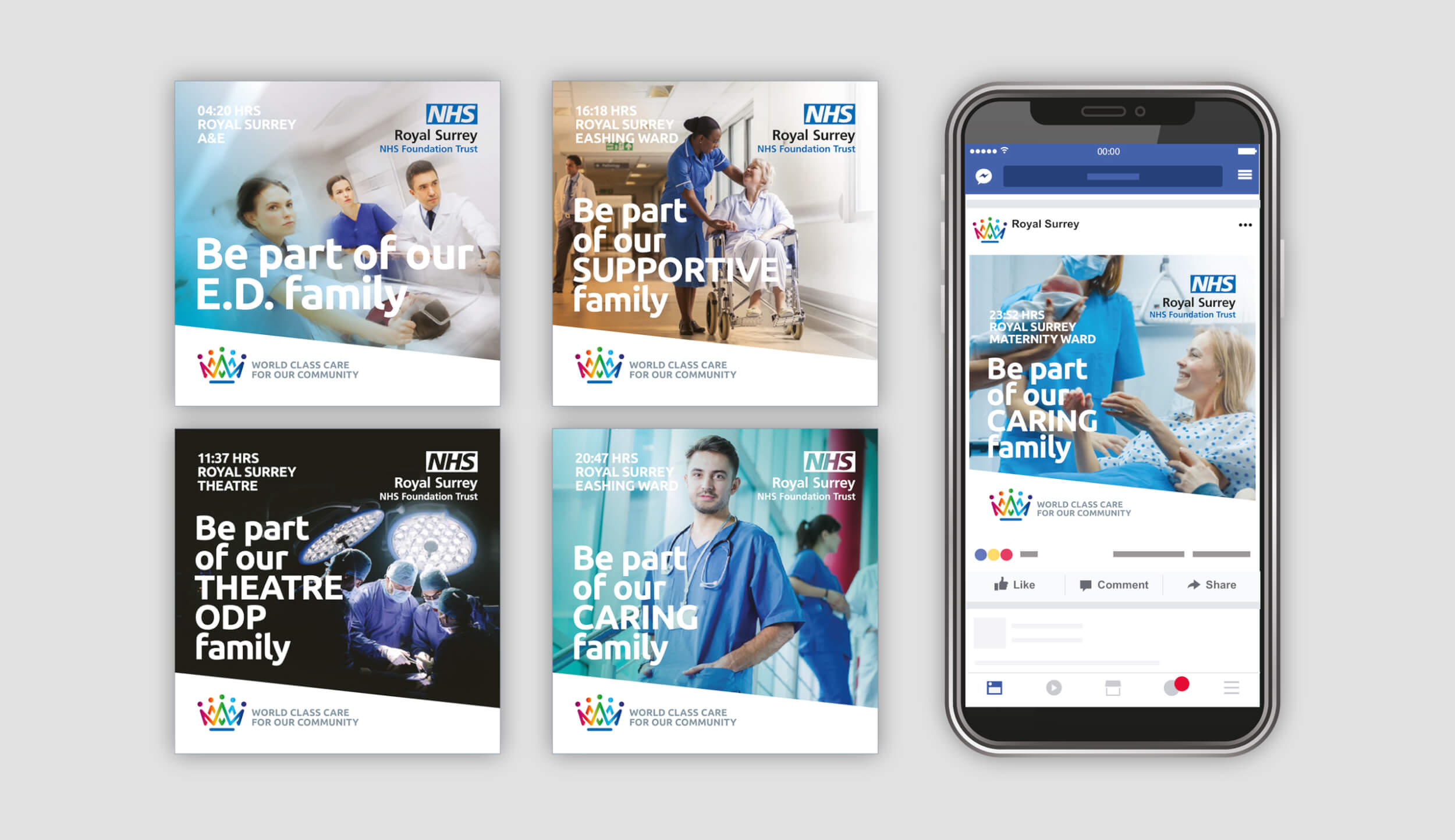
- Launch recruitment campaign

