October 17 2024
Tags:
Share:
Inclusive graphic design is good design. Accessibility considerations are not a barrier to, or excuse for, not creating good design. They’re a way to allow more people to engage with visual content.
Why are inclusive graphic design principles so important when creating visual content?
Accessible, inclusive design principles are relevant and helpful to everyone, not just individuals with diagnosed needs. We all benefit from good layout, clear visually-structured content, and well thought out, considered design.
Avoiding visual and sensory reactions can be achieved by small adjustments to design choices. Good contrast, font selection and simple layout decisions improve clarity, legibility and general visual comfort. To design in an accessible way is about being restrained and considered design. It’s about putting information and function first, embellishment and decoration second.
Five practices for more accessible design
- Good font choice. Choose fonts that are legible and offer good clarity, good proportions, character recognition and differentiation. Avoid fonts that have letter mirroring and identical letters. Read our blog on 10 tips for choosing fonts.
- Good use of colour. Use colour wisely. Consider the contrast between text and background tone. As a general rule, there should be no more than 70% difference. Never use colour alone to describe information – provide additional assistance such as text, pattern or symbol. Read our blog on how to make colours accessible.
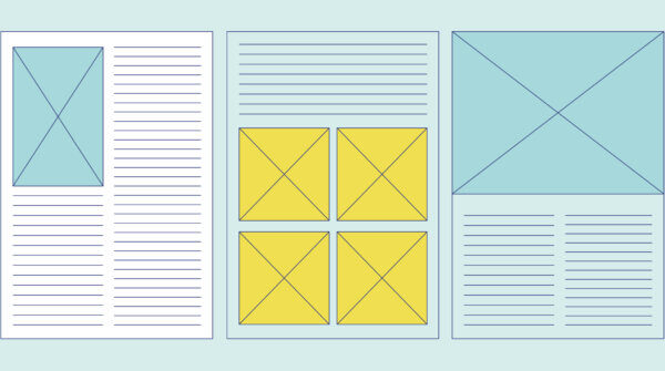
- Clear layout. Consistent and structured layout is an area of confidence and restraint in design, but it is a fact that it assists inclusivity. Use left-justified text, avoiding large blocks of copy and keeping style choices like block capitals and italics to a minimum as they can change the shape of letters and make them hard to read. Read our blog on good layout principles.
- Backgrounds and paper choice. A pure white background can be jarring and dazzling, so opt for a soft pastel tint or grey as an alternative. When printing, a silk or matt paper rather than gloss is preferable to avoid too much glare and reflection. A good weight of paper that avoids show-through from the other side can improve reading comfort.
- Alternative text image tags (or alt text). When creating a document that will eventually be saved or shared as a pdf, it is important to add alt text to imagery, maps, graphs or infographics. It has numerous purposes, including adding context and brevity to complex information. It also provides information for those who can’t see the images. These could include people with visual impairment, individuals who find too many images distracting, or those with poor bandwidth who have images turned off. Alt text isn’t just for website content.
If you’re thinking of commissioning a project and would like it to be as accessible as possible, let’s have a chat. We can give you advice about how to incorporate accessibility to your project whilst retain strong engaging design.


