The brief
Look Ahead provides care, support and housing services across 30 local authorities across London and the South East.
We have worked closely with the communications team for many years in helping them develop their brand and personality and one of the key annual communications is the Annual Review. This year the challenge and opportunity was to create a summary of the year that changed direction due to the pandemic. Look Ahead diversified rapidly while retaining their core values and it was our job to visualise this in an authentic way.
Our solution:
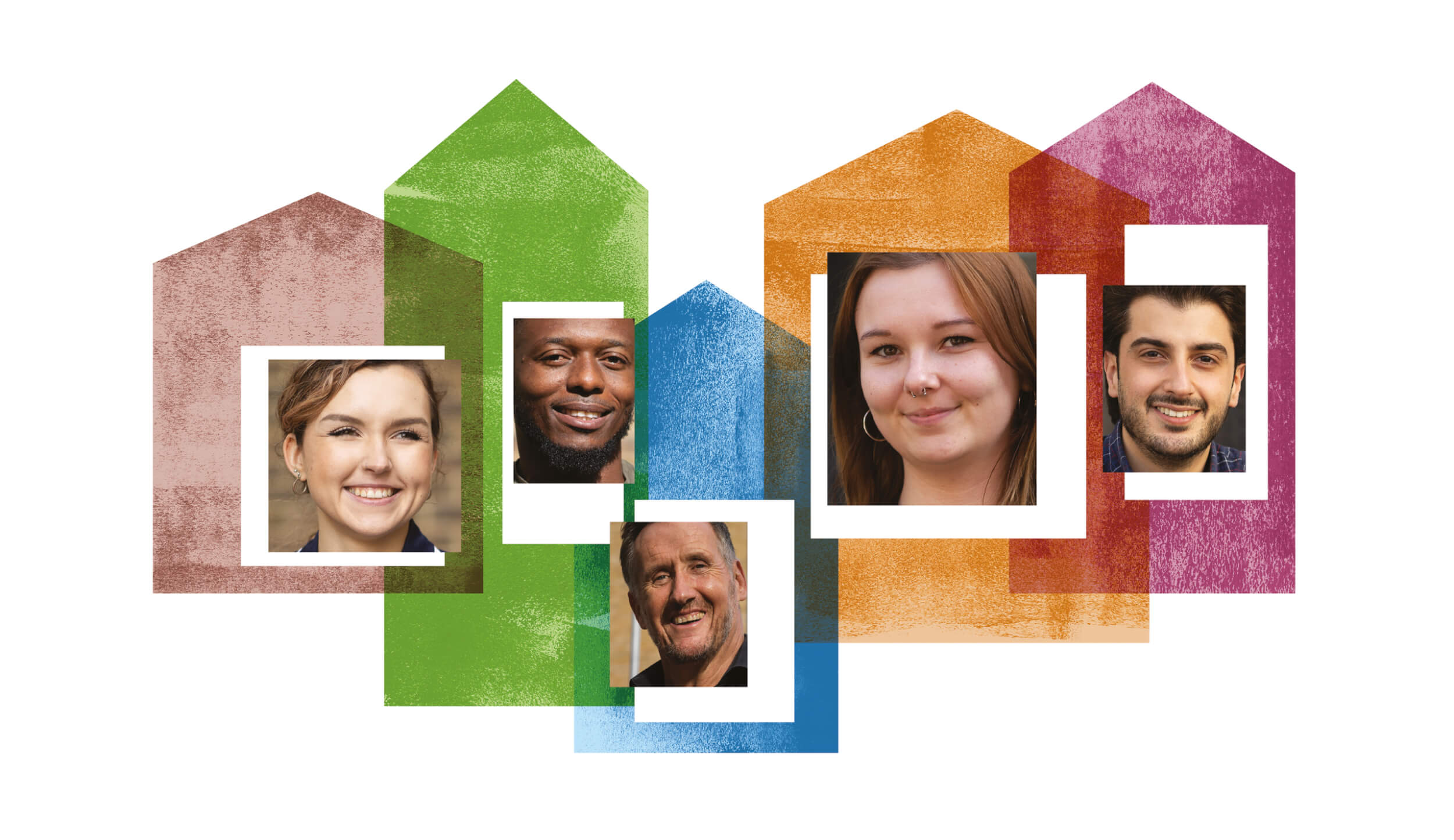
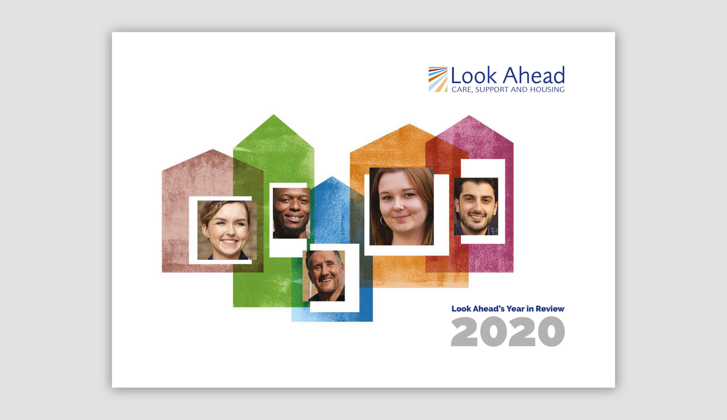
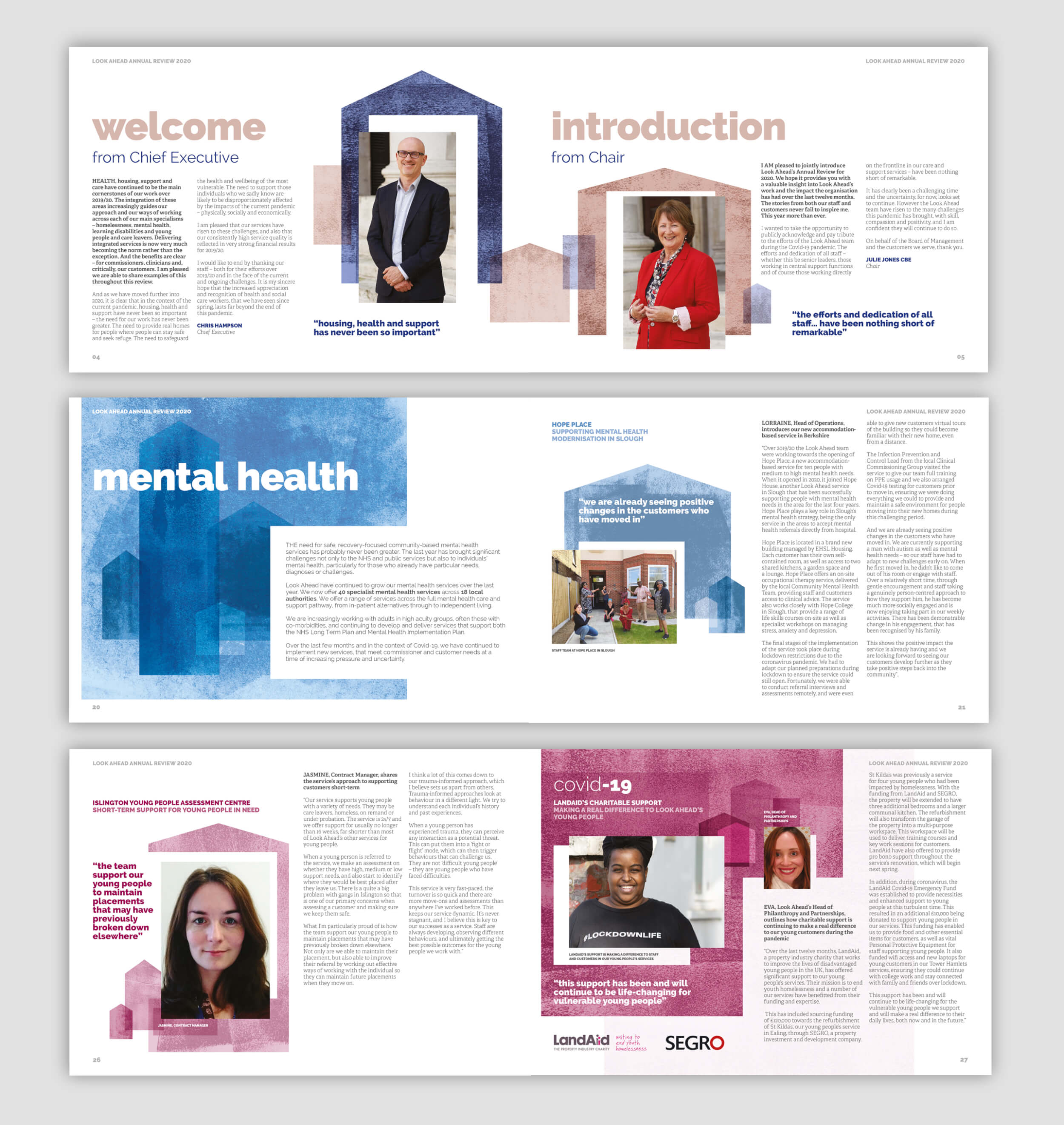
The annual review each year is based around a theme. For this year’s report we created a theme based around ‘home’. With housing at the heart of what Look Ahead provides it was the perfect visual way to show what different forms of ‘home’ means to everyone. It also seemed very apt in the current environment being able to resonate with everyone around the importance of support and protection that ‘home’ provides. The review centres around telling the customer stories across the range of services.
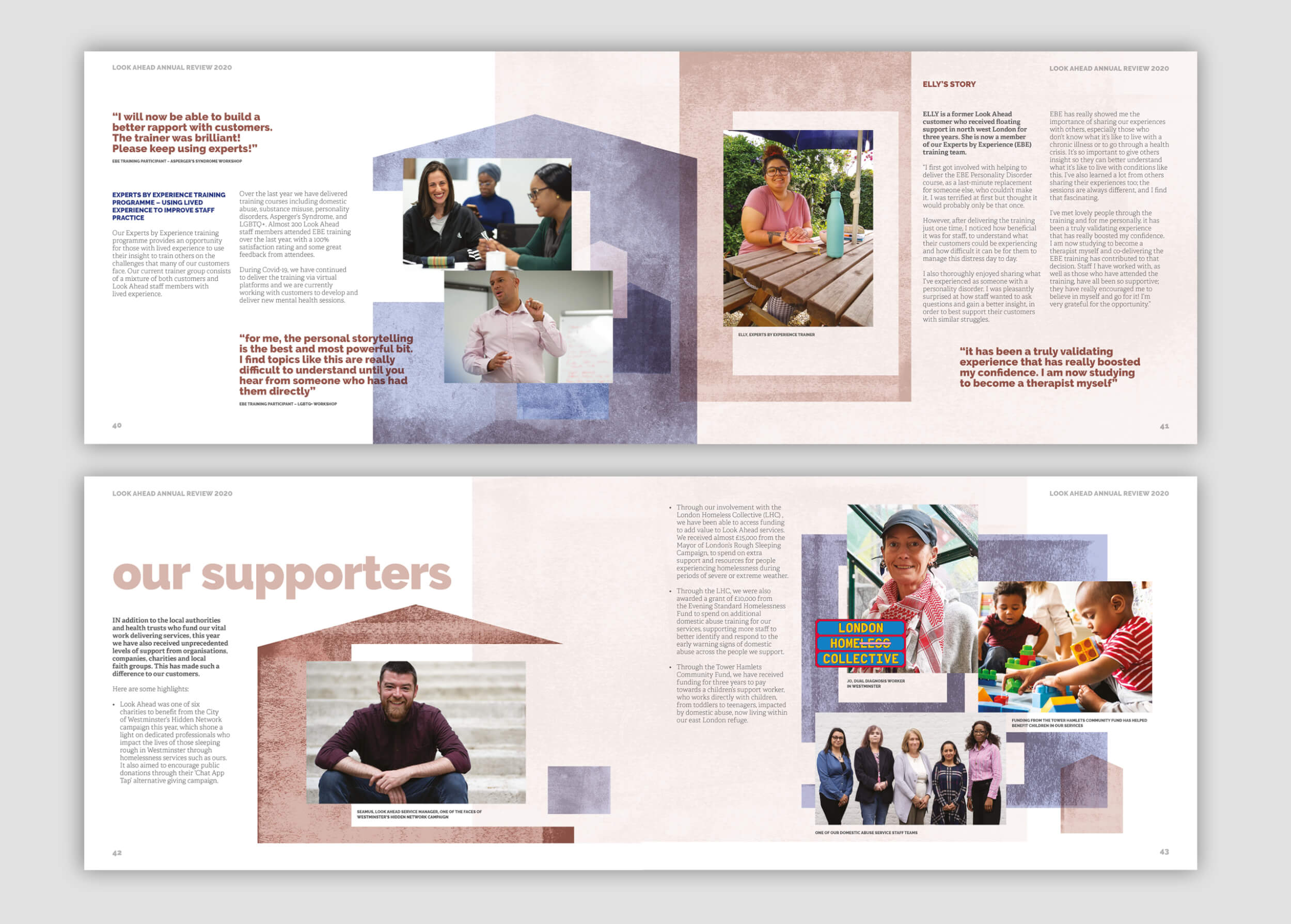
One of the key challenges this year was the sourcing of imagery. Look Ahead usually invest in professional photography to truly open up the windows to their great services and we are spoilt for choice with the engaging images provided by Richard Lewisohn. This year, although some were taken at a social distance, access and safety meant fewer opportunities to do so, so we needed a design style that would work with both professional and non-professional photography. The illustrational textured style we developed allowed us to use this flexibly and ‘house’ the images of both qualities. This gave the report a genuine and authentic account of the year so far, retaining customers front and centre.
Another challenge was to balance the customer stories around the need to report on the impact and services response successes of the organisation during the rise of Covid-19. We needed to champion these remarkable achievements while making sure they had the right weight of hierarchy within a review that covered a significant amount of time before the pandemic.


The annual review design followed the Look Ahead guidelines which we had developed with the team a few years earlier but we always look to evolve the branding and execution to create something on brand, but fresh and ‘homely’.
The services we delivered for this charity annual report included:
- Annual review design
- Service map creation
- Adherence to existing brand guidelines
- Print and online version
“We’ve worked with Door 22 for over four years and they have consistently delivered high quality work. They fully understand our organisation’s needs and are flexible to work to with us on what we are looking to achieve."
Look Ahead
